Table of Contents
Chapter Goals:
-
Understand how to transform survey results into numerical scores.
-
Understand how to generate a risk universe matrix—a visual heatmap of risk levels.
-
Understand how to prioritize risks.
Congratulations! You have persevered and proven that the naysayers who said this compliance initiative would never gain the support and buy-in necessary to make it work were wrong. You have tuned out the employees who did not want to take the time to complete the compliance risk assessment survey. You even survived the IT data collection disasters that surely happened. So, what are your next steps?
Eating the entire cake as a reward is certainly a good option, but not great for your diet. Throwing data at your compliance committee or other decision-making body and saying “your turn now” is not a good option for your company or career. This leaves you with the only viable option: morphing the raw data into useable data. Thus, your goal is to take the compliance risk assessment survey results and transform them into scores that can be plotted on a risk universe matrix—also known as a heatmap, dashboard, or risk map.
Creating a Risk Universe Matrix
Go back to your compliance risk assessment survey results. Someone (possibly you or a compliance committee) needs to review answers to the survey questions and determine how to turn them into numerical data. Look at whether or not policies or training are in place, whether or not the fine for noncompliance is jail time or a slap on the wrist, whether the law needs to be complied with on a daily basis, or whether this is a law that requires a simple report to an obscure agency every five years. Evaluate each law you have identified to be assessed in your universe of risk.
Someone (again, possibly you or a compliance committee) will then identify the level of compliance risk associated with a specific law. Quite frankly, this is the difficult part. How does a person or committee assess how likely your business is to violate one law or another as well as the potential impact on your business if an employee violates the law? But remember the charts from chapters 4 and 5 that delineate the different levels of risk involving likelihood and impact factors? These can guide you in determining a scoring system.
You or the compliance committee will sit down and look at survey answers for every law in your assessment. Soon you’ll get a sense of the laws dealt with daily, laws without policies or processes in place for your business to even begin to be in compliance, and laws that create the most liability in terms of compliance with the law and other factors. You’ll look at both the likelihood of noncompliance occurring and its impact on your business. You will then try to assign two numerical scores to the compliance risks—one for likelihood and one for impact. You can then use these scores to plot each risk on a chart—your risk universe matrix. This matrix is also known as a heatmap, because the risks with high ratings on both factors are the hottest (or most in need of attention).
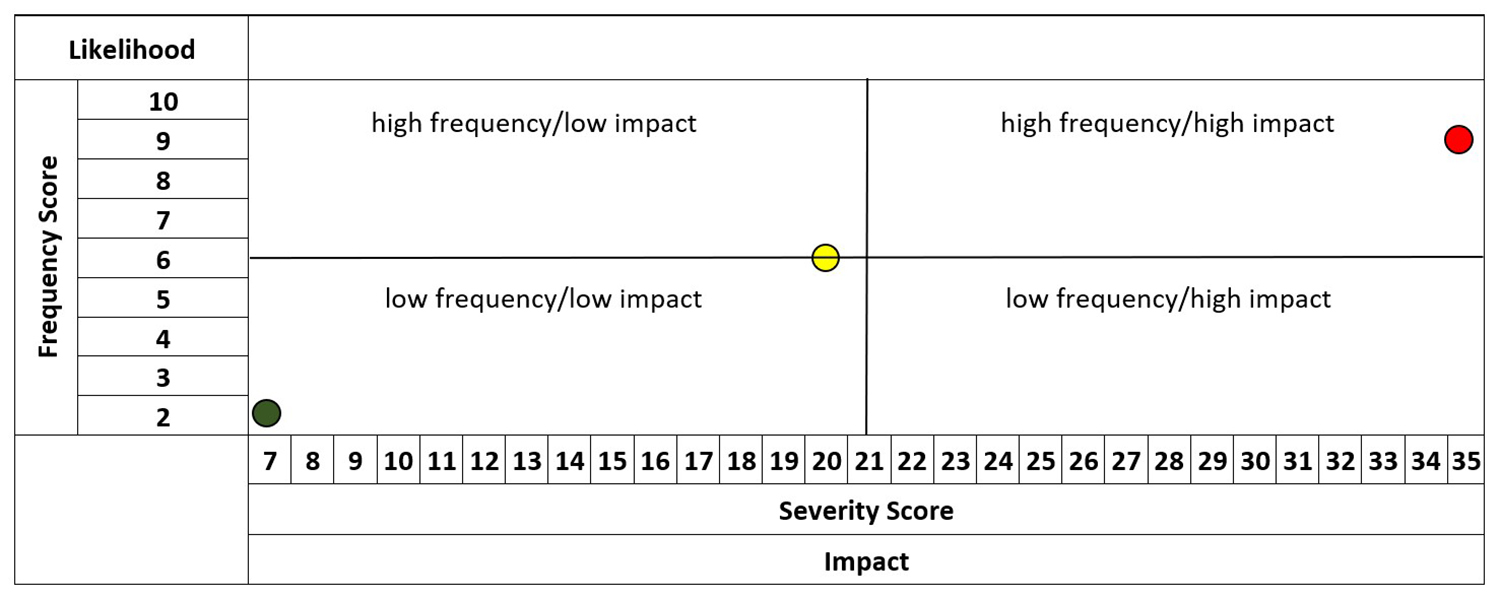
To generate this matrix, plot each risk by locating the likelihood score along the vertical axis and the impact score along the horizontal axis. The risks that lie closest to the top right corner are the biggest problems, and those laying closest to the bottom left corner are the smallest.
The likelihood score is determined by two numbers, both represented on a 1–5 scale (see chapter 4). Add those two numbers together and your likelihood score will range from a low of 2 to a high of 10. Similarly, the impact score is produced by adding the numerical ratings for all impact factors—the example in chapter 5 has seven columns of factors represented. Added together, these become one score that ranges from 7–35.
As an example, let’s plot three laws on a sample matrix (see Figure 4: Risk Universe Matrix Example). If an assessment of a particular law generated a 2-point Frequency Score on the Likelihood axis and a 7-point Severity Score on the Impact axis, that law would be identified as having a low risk. It would be represented by a dot in the bottom left corner of the risk matrix. If color-coding your laws, this would be in the green zone and classified as low risk. If an assessment of another law generated a 6-point Frequency Score on the Likelihood axis and a 20-point Severity Score on the Impact axis, it would be represented by a dot in the middle of the risk matrix and be classified as a medium risk. If color-coding, this would be in the yellow zone. If another law had a 9-point Frequency Score on the Likelihood axis and a 35-point Severity Score on the Impact axis, it would lie in the upper right corner of the matrix and would be identified as one of your chief risks. A color-coded matrix would put this in the red zone.
Figure 4: Risk Universe Matrix Example
